Components are available in .mdx files without imports.
They inherit semantic theme tokens and expose stable tidy-* classes and data-component parts. Projects and theme plugins can replace any built-in by registering the same MDX component name.
Cards and grids
Use CardGroup for linked destination cards. It collapses to one column on small screens. Columns is the neutral layout primitive; Grid is an alias.
 <CardGroup columns={2}>
  <Card title="Quickstart" href="/docs/getting-started" icon="terminal">
    Build and preview a site in a few minutes.
  </Card>
  <Card title="Configuration" href="/docs/configuration" icon="settings" eyebrow="Reference">
    Understand every project-level setting.
  </Card>
</CardGroup>
Example — CardGroup
Build and preview a site in a few minutes.
Understand every project-level setting.
 <Grid columns={2}>
  <Panel title="Content">Main reading region</Panel>
  <Panel title="Context">Supporting information</Panel>
</Grid>
Example — Columns / Grid
| Component | Prop | Type | Default |
|---|---|---|---|
Card | title | string | required |
Card | href | string | unlinked card |
Card | icon / eyebrow | string | — |
Card | external | boolean | inferred from URL |
CardGroup | columns | 1 | 2 | 3 | 4 | 2 |
Columns / Grid | columns | 1 | 2 | 3 | 4 | 2 |
Columns / Grid | gap | "sm" | "md" | "lg" | "md" |
Card also accepts an icon named slot for project SVG or Astro icon components.
Accordions
Accordion uses native <details> semantics, so it remains keyboard-accessible and useful without JavaScript.
 <AccordionGroup>
  <Accordion title="Where does content live?" open>
    Under `site/src/content/` in Git-tracked Markdown or MDX files.
  </Accordion>
  <Accordion title="Can I replace this component?">
    Yes. Register your own `Accordion` through `mdx.components` or a plugin.
  </Accordion>
</AccordionGroup>
Example — AccordionGroup
Where does content live?
Under site/src/content/ in Git-tracked Markdown or MDX files.
Can I replace this component?
Yes. Register your own Accordion through mdx.components or a plugin.
| Component | Prop | Type | Default |
|---|---|---|---|
Accordion | title | string | required |
Accordion | open | boolean | false |
Accordion | icon | string | — |
Badges, banners, and panels
All three share the tones neutral, accent, info, success, warning, and danger.
 <Badge tone="success">Stable</Badge>

<Banner title="Build output" tone="info">
  The static site is written to `site/build/`.
</Banner>

<Panel title="Runtime status" eyebrow="TidyPress" icon="terminal" tone="success">
  Content, routes, and search are ready.
</Panel>
Example — Badge, Banner, and Panel
StableContent, routes, and search are ready.
Badge accepts an optional href. Panel is a structured information container with a separated header, content region, and optional footer; unlike Callout, it is not an inline editorial aside. It accepts an icon name and named icon, header, and footer slots for imported Astro components.
Code groups and keyboard input
CodeGroup turns direct fenced-code children into an accessible tab set. Labels must match the number and order of code blocks. Arrow, Home, and End keys navigate tabs.
 <CodeGroup labels={["npm", "pnpm"]}>
```bash
npm install -g tidypress
```
```bash
pnpm add -g tidypress
```
</CodeGroup>

Press <Kbd>Cmd</Kbd> + <Kbd>K</Kbd>.
Example — CodeGroup and Kbd
npm install -g tidypress pnpm add -g tidypress Press Cmd + K.
Frame
Frame gives live embeds, diagrams, interactive previews, or arbitrary content a consistent presentation surface. It is deliberately broader than Image: use Image for semantic media and Frame when the framed content is an application, iframe, rendered artifact, or custom composition.
 <Frame caption="The generated build artifact, embedded as a live document.">
  <iframe
    src="/embeds/build-receipt.html"
    title="Generated static build receipt"
    height="260"
    loading="lazy"
  />
</Frame>
Example — Frame
| Prop | Type | Default |
|---|---|---|
caption | string | — |
href | string | — |
class | string | — |
Image
Use Image for semantic still media, optional dimensions, and captions.
 <Image
  src="/images/flower.jpg"
  alt="Colorful tulips in bloom"
  caption="Vivid spring flowers"
/>
Example — Image
| Prop | Type | Default |
|---|---|---|
src | string | ImageMetadata | required |
alt | string | required |
caption | string | — |
width | number | — |
height | number | — |
zoom | boolean | global mdx.imageZoom setting (true by default) |
The same image can use plain Markdown when no component caption or sizing is needed:
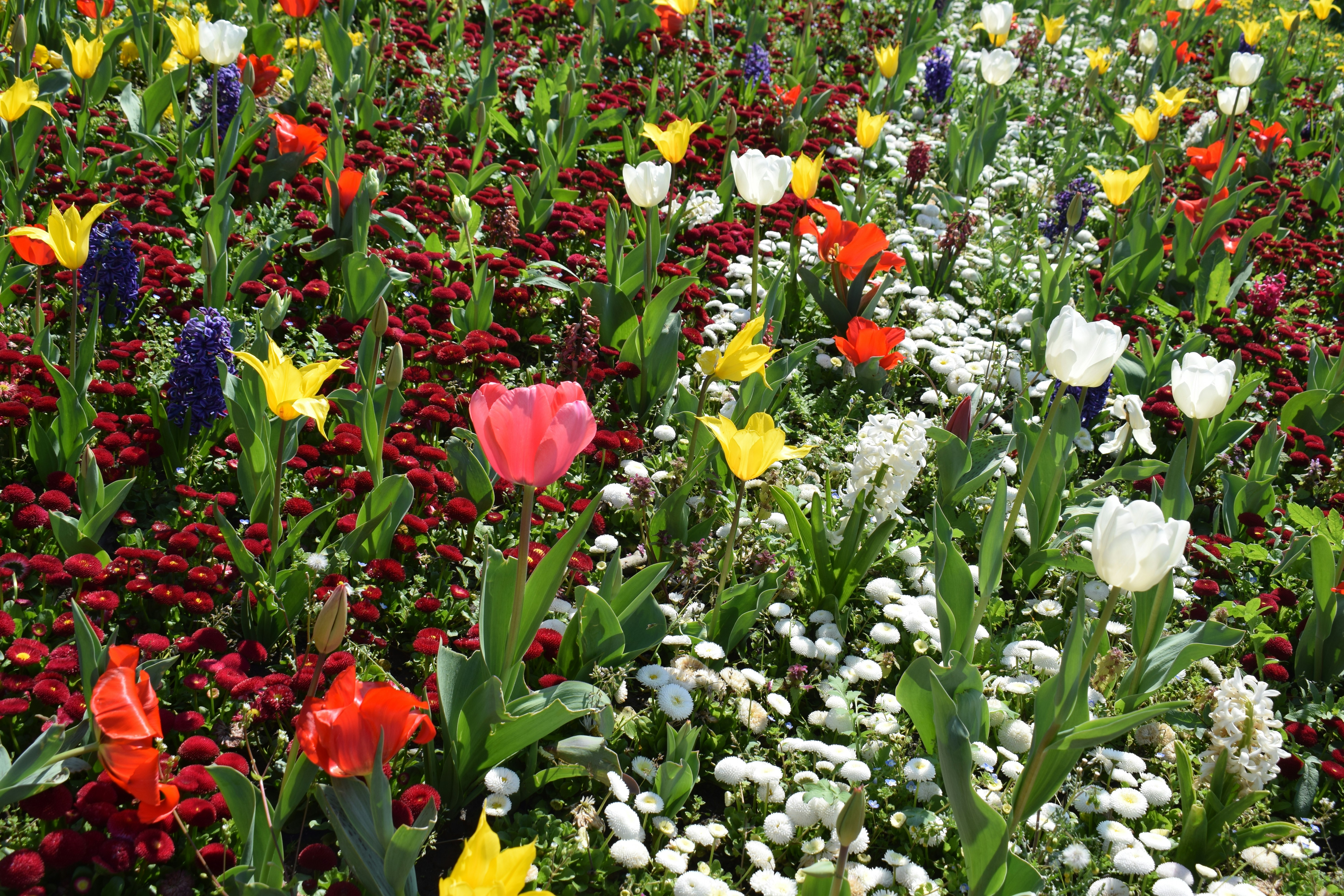 Markdown and MDX content images open in a centered focused viewer. Set zoom={false}
on an individual Image, or set mdx.imageZoom: false in site config to disable
the behavior globally.
Video
Use Video for native footage with TidyPress playback, audio, replay, and viewport behavior.
 <Video
  src="/videos/flower.mp4"
  poster="/images/flower.jpg"
  title="TidyPress video demonstration"
  caption="Custom playback, mute, and replay controls."
  autoplayOnView
/>
Example — Video
The player pauses when it leaves the viewport and resumes when at least 60% is visible. Viewport autoplay always begins muted so browser autoplay policy can be respected; the reader can unmute from the top-right control. Set autoplayOnView={false} for click-only playback or pauseWhenOutOfView={false} to let a started video continue offscreen.
| Prop | Type | Default |
|---|---|---|
controls | boolean | true |
autoplay | boolean | false |
autoplayOnView | boolean | false |
pauseWhenOutOfView | boolean | true |
loop | boolean | false |
muted | boolean | false |
playsinline | boolean | true |
API fields and responses
Use these composable primitives for hand-authored API/reference pages. They do not replace future OpenAPI generation.
 <ApiField name="collection" type="string" required location="query">
  Limits results to one configured collection.
</ApiField>

<ApiField name="limit" type="number" default={20} location="query">
  Maximum number of entries to return.
</ApiField>

<ApiResponse status={200} description="Search results">
  Returns the matching entries and their canonical URLs.
</ApiResponse>

<ApiResponse status={404} description="Collection not found">
  The requested collection key is not registered.
</ApiResponse>
Example — API fields and responses
collection string required query Limits results to one configured collection.
limit number query Default: 20
Maximum number of entries to return.
200 Search results Returns the matching entries and their canonical URLs.
404 Collection not found The requested collection key is not registered.
Callout
Notes, warnings, tips, and pull quotes.
 <Callout>The config file lives at `site/tidypress.config.ts`.</Callout>

<Callout type="warning">Do not commit `site/build/` — it is generated. Deploy it, do not treat it as source.</Callout>

<Callout type="tip">Run `tidypress clean` if a build looks stale after upgrading TidyPress.</Callout>

<Callout type="quote">The canonical copy lives in git, not in an export workflow.</Callout>

<Callout
  lineColor="#7c3aed"
  backgroundColor="color-mix(in oklab, #7c3aed 8%, var(--bg))"
>
  Callouts can carry a project-owned signal without replacing the component.
</Callout>
Example — Callout tones
Example — Custom Callout color
| Prop | Type | Default |
|---|---|---|
type | "note" | "warning" | "tip" | "quote" | "note" |
lineColor | CSS color string | tone default |
backgroundColor | CSS color string | transparent |
class | string | — |
Tabs
Alternate commands or examples.
 <Tabs labels={["npm", "pnpm"]}>
<Tab>
```bash
npm install -g tidypress
```
</Tab>
<Tab>
```bash
pnpm add -g tidypress
```
</Tab>
</Tabs>
Example — Tabs
npm install -g tidypress pnpm add -g tidypress | Prop | Type | Required |
|---|---|---|
labels | string[] | yes |
labels must match the number of direct <Tab> children.
FileTree
Project structure. Folders collapse on click. Wrap important files in ** to highlight them. In plain txt trees elsewhere in the docs, inline # comments label collections — for example # docs collection — sidebar-ordered guides at /docs/….
 <FileTree>
- site/
  - **tidypress.config.ts**
  - public/
    - images/
  - src/
    - content/
      - writing/
        - hello.md
      - projects/
      - docs/
        - getting-started.md
</FileTree>
Example — FileTree
- site/
- tidypress.config.ts
- public/
- images/
- src/
- content/
- writing/
- hello.md
- projects/
- docs/
- getting-started.md
- writing/
- content/
Two spaces per indent level. No props.
Mermaid
Mermaid diagrams.
 <Mermaid code={`
flowchart LR
  Markdown[Markdown files] --> Build[tidypress build]
  Build --> Static[Static site]
  Static --> Host[Static host]
`} />

<Mermaid align="center" code={`flowchart TB\n  A --> B`} />
Example — Mermaid flow
Example — Centered Mermaid flow
| Prop | Type | Default | Required |
|---|---|---|---|
code | string | — | yes |
align | "left" | "center" | "right" | "left" | no |
Diagrams adapt when the theme changes. Use align="center" for tall vertical flowcharts in narrow writing columns.
Tooltip
Short inline definitions.
The <Tooltip tip="Static HTML and search land in site/build/ after tidypress build.">build folder</Tooltip> is regenerated on each build. Example — Tooltip
The build folder Static HTML and search land in site/build/ after tidypress build. is regenerated on each build.
| Prop | Type | Required |
|---|---|---|
tip | string | yes |
Steps
Numbered procedural instruction rails in MDX. Each step accepts arbitrary nested Markdown and components—paragraphs, callouts, code blocks, lists, tables, and media. Manual pages use the same primitives with manual page chrome.
 <Steps>
  <Step title="Create content">
    Add a post under `site/src/content/writing/`, work under `projects/`, or a guide under `site/src/content/docs/`.

    <Callout type="tip">Keep the canonical source in Git.</Callout>
  </Step>
  <Step title="Preview locally">
    Run `tidypress dev`.
  </Step>
</Steps>
Example — Steps
- Create content
Add a post under
site/src/content/writing/, work underprojects/, or a guide undersite/src/content/docs/. - Preview locally
Run
tidypress dev.
| Component | Prop | Type | Required |
|---|---|---|---|
Steps | start | number | no |
Step | title | string | no |
Wrap one or more <Step> elements inside <Steps>.
Replacing primitives in a theme pack
Project config has final precedence over the baseline pack:
 export default defineConfig({
  mdx: {
    components: {
      Card: './src/theme/components/Card.astro',
      Steps: './src/theme/components/Steps.astro',
      ApiField: './src/theme/components/ApiField.astro',
    },
  },
})
A project-local theme plugin can register the same replacements as a reusable group:
 import { definePlugin } from 'tidypress'

export default definePlugin({
  name: 'studio-theme',
  setup(theme) {
    theme.addMdxComponent('Card', './src/theme/components/Card.astro')
    theme.addMdxComponent('Banner', './src/theme/components/Banner.astro')
    theme.addStyle('./src/theme/studio.css')
  },
})
If replacement is unnecessary, override the public classes—such as .tidy-card, .tidy-step, and .tidy-api-field—or component variables like --tidy-card-radius, --tidy-card-padding, and --tidy-frame-padding in project CSS. Semantic tokens such as accent, focus, success, warning, and danger flow into the baseline components automatically.
Native details
Native HTML also works:
 <details>
<summary>Generated files</summary>

```txt
site/build/
```

</details>
Example — Native details
Generated files
site/build/